Design
12 Bad Landing Page Examples– Tips to Fix Them for Startup Founders (Free Review!)

May 5, 2025
March 26, 2025

Making a company from scratch is hard—90% fall apart!
Maybe your new landing page is too hazy to convey your service.
Some issues occur when opening a niche, and startup founders shouldn’t stress them.
But large mistakes burn cash too soon or turn down your brand position.
No worries!

Here we arrange 11 bad landing page examples to educate you about what to do and what not to do.
Moreover, we added some tips to overcome these issues as a professional.
Let’s jump over!
Bad Landing Page Example #1: Priyopay- Misses Simple Directions for New Users
PriyoPay offers a simple and quick way that guide user with their money.
People can tap the PriyoPay app to pay their routine bills, like rent, energy, water, and phone payments.
But some bugs occurred in their landing page in that time and they immediately knocked us to fix them.
We designed PriyoPay to be easy for everyone to use.
Here is the review of priopay that how they felt about ofspace.

Key Mistakes
Priyo Pay lacks simple tips for new users. It’s hard to figure out and send money fast.
Priyo Pay skips a start plan for new users.
It’s tough to spot big things like payments and past records.
Key stuff lacks small clues or directions.
What To Do?
- Include basic steps for beginners to use.
- Boost the way around with easy words for important tasks.
- Use small tips or short guides to explain stuff soon.
Here’s an Example of What We Can Do
We transformed PriyoPay’s landing page into a high-converting, sleek design that enhances user experience.
Bad Landing Page Example #2: Chase - Too Many CTAs
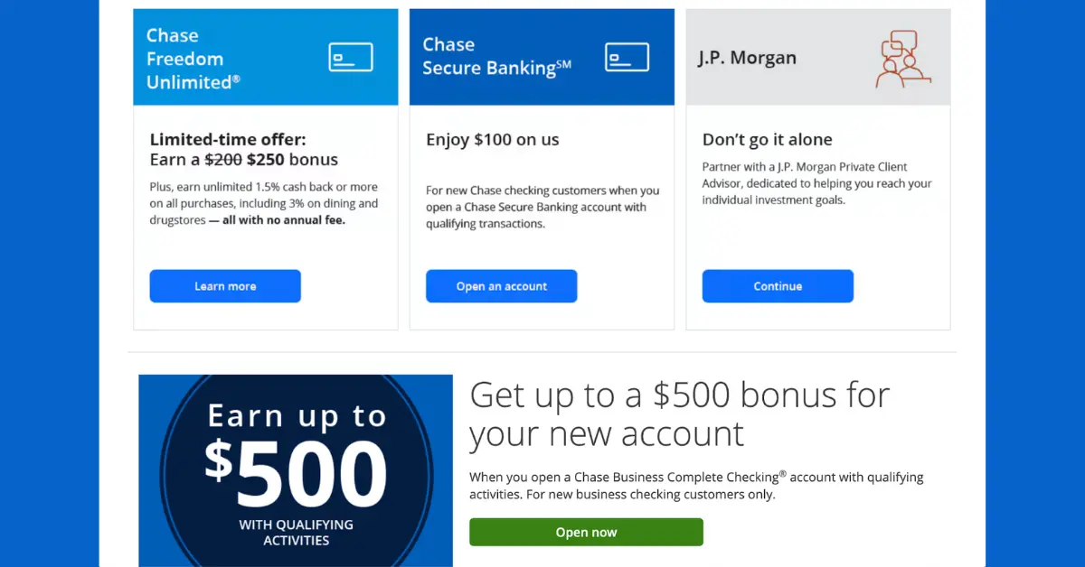
Key Mistakes
Chase's landing page is a clear example of CTA overload.
It floods visitors with multiple calls-to-action, from credit card offers to login buttons, all in the same style.
The login button looks the same as the other CTAs, making everything blend.
Below, visitors see links for savings, checking, credit cards, home loans, and auto loans. The choices seem endless.
What To Do?
- Use one primary CTA per page
- Keep different user paths visually distinct
- A/B test different CTA placements
Bad Landing Page Example #3: Frontier Communications - Design Hurting Conversions
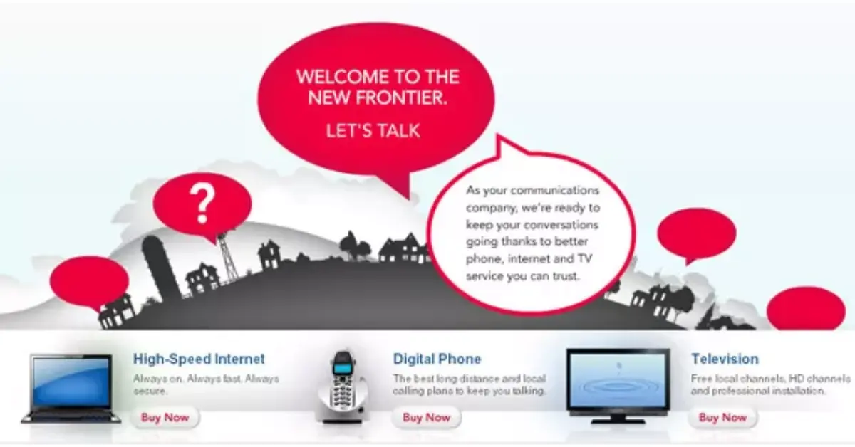
Key Mistakes
A study on conversion success found that clear CTAs boost conversions by up to 32% over clever wording.
Frontier Communications’ page proves this. The design confuses visitors instead of guiding them.
A word bubble layout makes it hard to understand the service options. The "Buy Now" button adds friction, as users need more details before committing.
What To Do?
- Clarity matters more than creativity
- Match CTA wording to the buying stage
- Use direct messaging to explain values
Bad Landing Page Example #4: MultiTouch - Weak Content That Doesn’t Convert
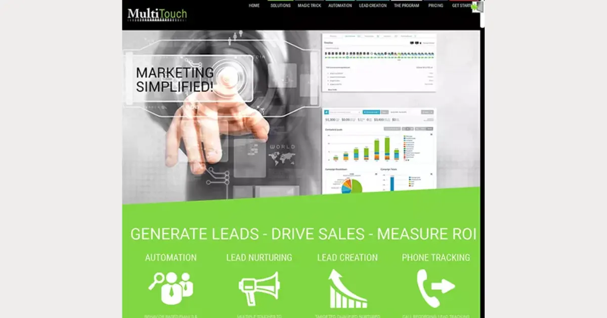
Key Mistakes
A Marketing Experiments study found that specific, benefit-driven headlines convert 58% better than vague ones.
Multitouch’s landing page uses a generic stock image of a man in a suit.
The headline, “Marketing Simplified!” says nothing about the product’s value.
Important features get buried under confusing graphs.
What To Do?
- Avoid stock images that add no value
- Use headlines that highlight benefits
- Keep key features clear and easy to find
Bad Landing Page Example #5: Zendesk - Using a Homepage Instead of a Landing Page
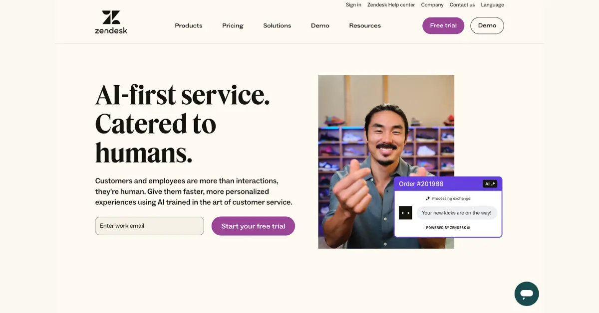
Key Mistakes
UX study found that dedicated landing pages convert 40% better than homepages.
Zendesk made a mistake by sending Google Ads traffic to their homepage.
The page is full of distractions—navigation links, footers, and sign-up forms.
These create exit points that pull users away from the intended action.
What To Do?
- Use dedicated landing pages for ads
- Remove extra navigation to focus conversions
- Align landing page headlines with ad messages
Bad Landing Page Example #6: SAP Software Solutions - A Resource Page, Not a Landing Page
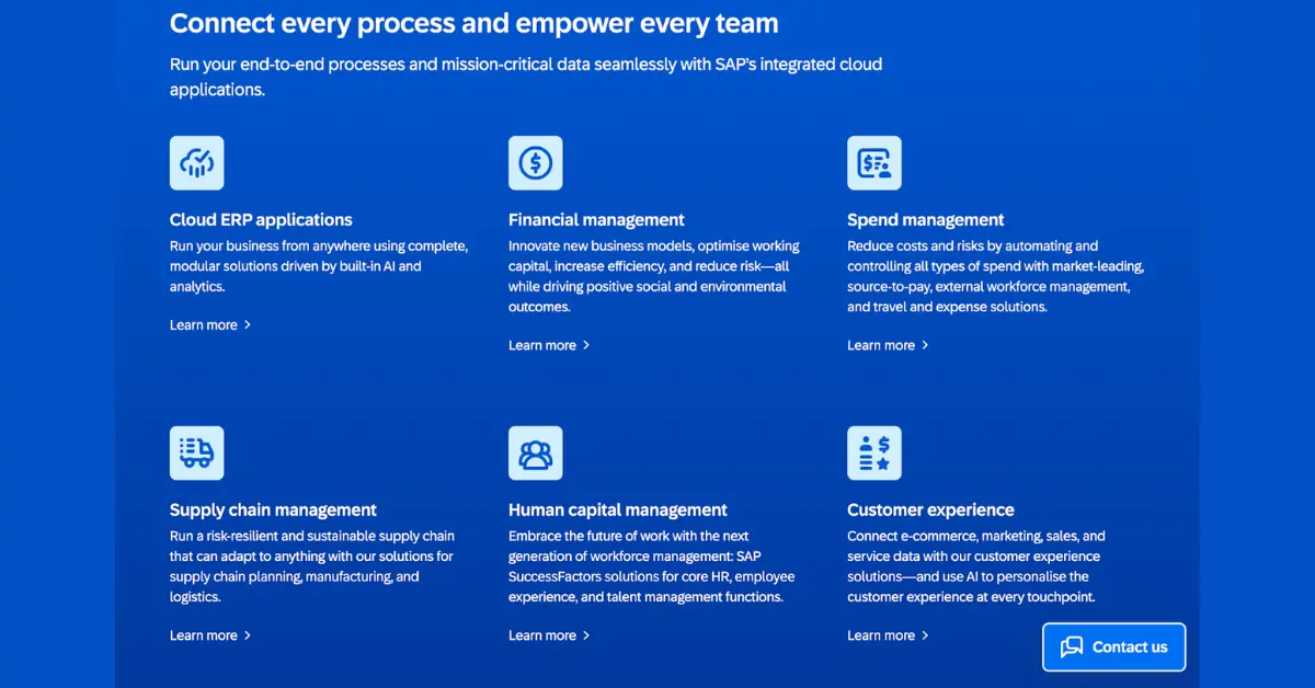
Key Mistakes
SAP’s page fails by overloading visitors with too many links.
The headline and image work well, but the rest of the page bombards users with endless navigation links.
The design feels more like a resource hub than a conversion-focused page.
What To Do?
- Keep landing pages focused on one goal
- Move extra links to a resource section
- Use a clear visual hierarchy for CTAs
Bad Landing Page Example #7: Advanced Hair Studio - Misleading CTA
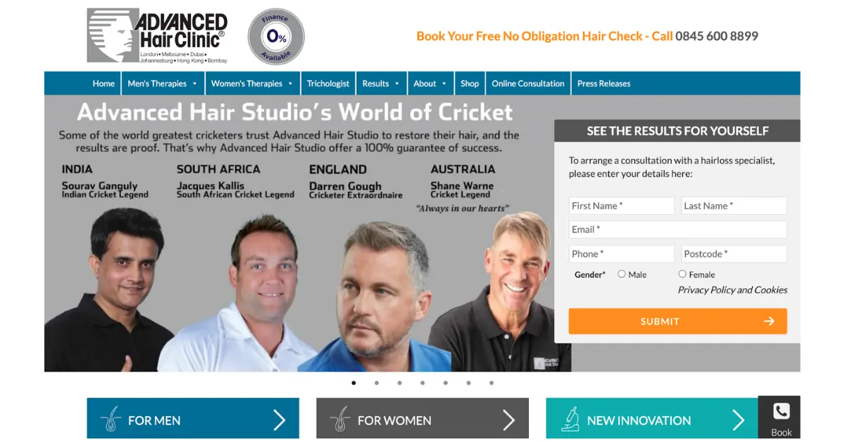
Key Mistakes
The UX Design Institute found that broken or misleading CTAs raise bounce rates by 78%.
Advanced Hair Studio made this mistake with a coupon button that didn’t work.
Their page is also crammed with detailed service descriptions better suited for separate pages.
The misleading CTA created false expectations, damaging trust.
What To Do?
- Make sure CTAs work and deliver as promised
- Place detailed info on separate service
pages
- Avoid promotions that create false hope
Bad Landing Page Example #8: The Content Folk - No Clear CTA
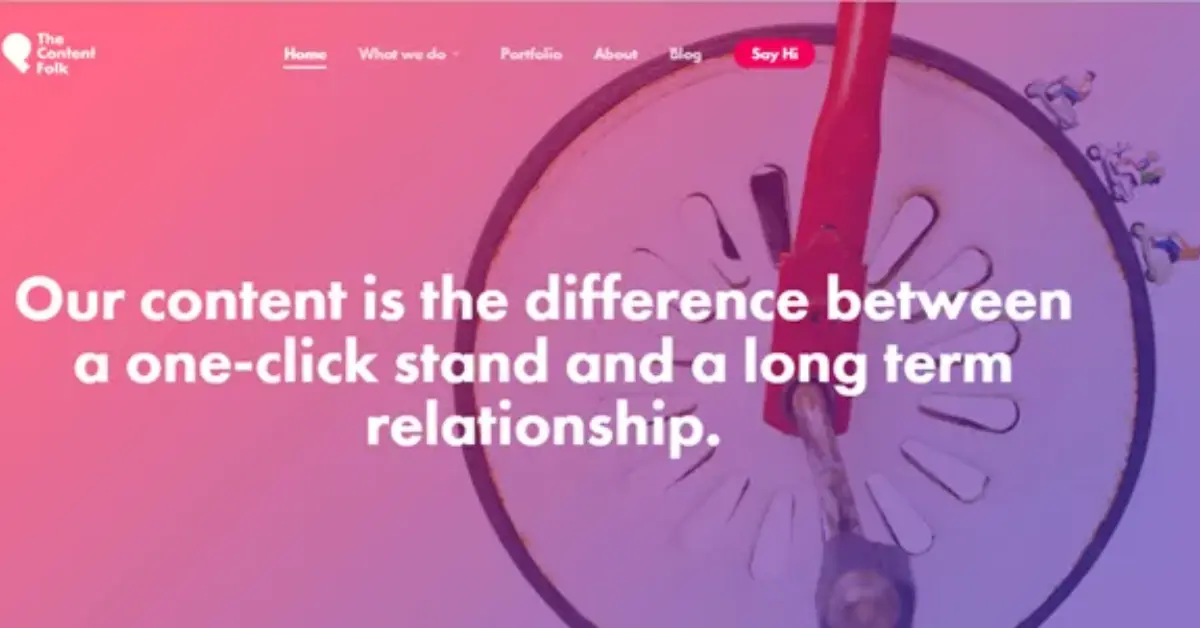
Key Mistakes
Their landing page looks good but lacks an effective CTA.
The “Say Hi” button is vague and doesn’t push users to take action.
Besides, an abstract image adds to the confusion.
What To Do?
- Use action-driven CTAs that show value
- Balance design with function
- Pick images that support the service
Bad Landing Page Example #9: KeyShot 5 - Confusing Form
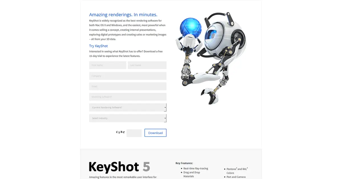
Key Mistakes
KeyShot’s landing page is confusing.
The form has unclear labels and a captcha that adds friction.
The page needs clearer labels, a more specific CTA, and fewer distractions.
What To Do?
- Make forms easy to understand.
- Use specific CTAs.
- Remove unnecessary elements.
Bad Landing Page Example #10: RoomKey - Jargon and Weak Testimonials
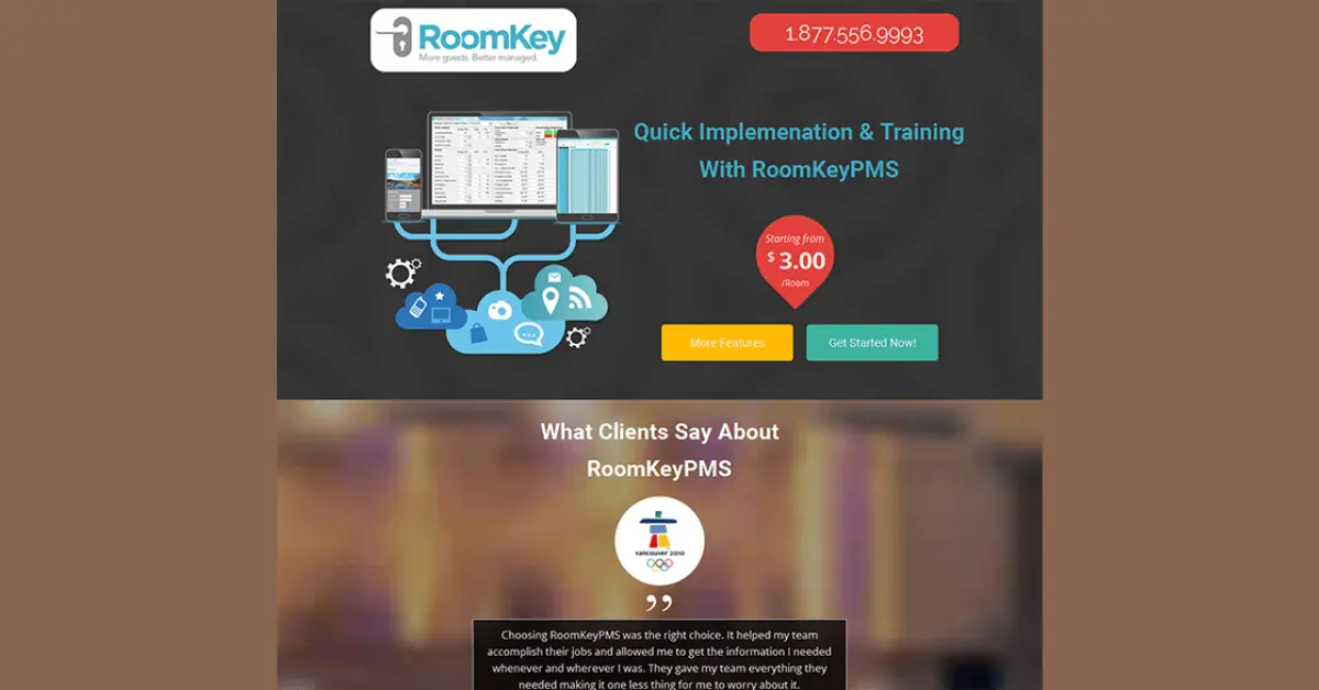
Key Mistakes
RoomKey’s landing page uses confusing jargon like “PMS.”
The headline is unclear, and the hero shot doesn’t explain the product well.
The testimonials are generic and don’t highlight specific benefits.
What To Do?
- Avoid jargon and use clear language.
- Use visuals that explain the product.
- Highlight specific benefits in testimonials.
Bad Landing Page Example #11: Qlik - Secondary Hero Shot
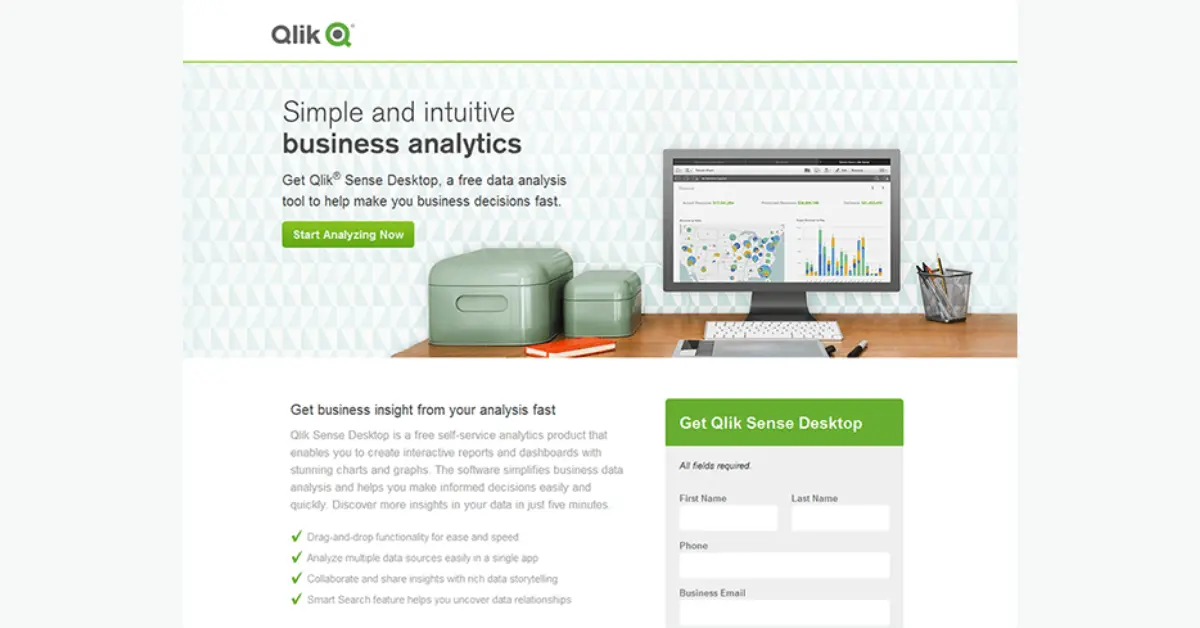
Key Mistakes
Qlik’s landing page has a strong value proposition but a weak hero shot.
The screenshot of the software is too small and secondary.
What To Do?
- Make the hero shot prominent.
- Use visuals that highlight key features.
- Keep the design clean and focused.
Bad Landing Page Example #12: Avalaunch Media - Readability Issues
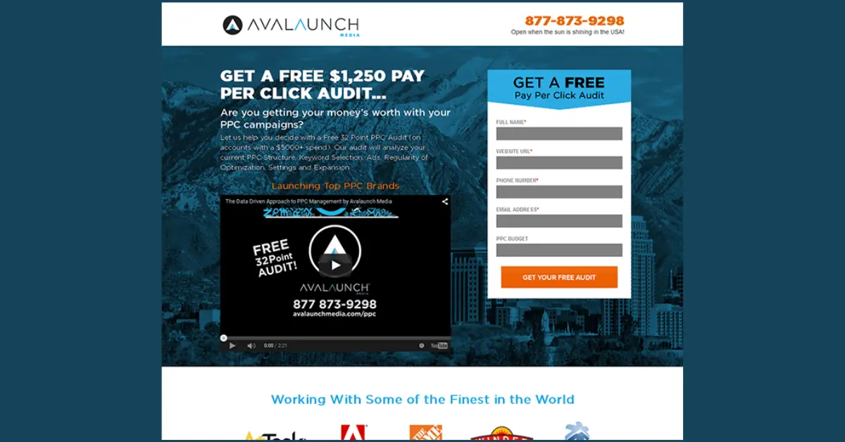
Key Mistakes
Avalaunch Media’s landing page has readability issues.
The headline is cut off, and the text is hard to read.
The form is unclear about what users will get.
The page needs better readability, clearer forms, and stronger testimonials.
What To Do?
- Improve readability with clear text.
- Explain the process in the form.
- Use specific and strong testimonials.
How to Fix a Bad Landing Page
Mistakes are often made by human beings. But there is always a chance to fix them.
Here are some quick tips on how startup founders can turn a bad landing page around.
1. Get Clarity on Your Value
Write a one-sentence value proposition for your SaaS. Make that your headline.
Anyone who reads it should instantly know what problem you solve or the benefit you
provide.
2. Pick One Primary CTA
Decide on the single most important action you want a visitor to take (sign up, start a trial, request a demo, etc.).
Design your page around that.
Use a big, contrasting button for it. If you have secondary actions (like “Learn
more” or “Contact sales”), make them less visually prominent.
3. Simplify Your Design
Remove any element that doesn’t support the main goal.
Extra images, navigation menus, or long explanations might be distracting.
Aim for a clean layout with plenty of white space.
If they can’t recall the main message or button, you might need to simplify
further.
4. Make it Fast and Mobile-Friendly
Use tools (or just your own phone) to check your page speed and mobile layout.
Compress images, eliminate unnecessary scripts, and ensure buttons and text look good on small screens.
Studies say a fast, easy experience on all devices will prevent users from bouncing
due to technical frustrations.
5. Add Trust Elements
Include a few short testimonials from happy customers, or logos of companies that use your product.
Also, if applicable, add trust badges (e.g. “GDPR compliant” or “Trusted by 5000+ users”) near your CTA.
Show that real people get real services from your SaaS.
6. Test and Tweak
Lastly, treat your landing page as a living project.
Use A/B testing for different headlines or designs.
Watch recordings or analytics to see where people click or drop off.
If you notice, for example, many are clicking on a non-critical link or not scrolling, you can adjust your layout or remove distractions.
Let’s Build Your Landing Page Together
Landing pages haunt worse than Halloween if customers run!
We have been in this industry for more than half a decade and we found that special pages crush homepages by 40%, and one action beats messes by 13.5%.
We suggest that you should keep your user journey smooth through your startup landing page.
To do so, maintain precise text and clear goals.
Your buttons must work and show the way.
You better grab a coffee and dial ofspace to get aware of your startup landing page potentiality.
It’s completely free!